[Last modified: March, 24 2019 04:06 PM]

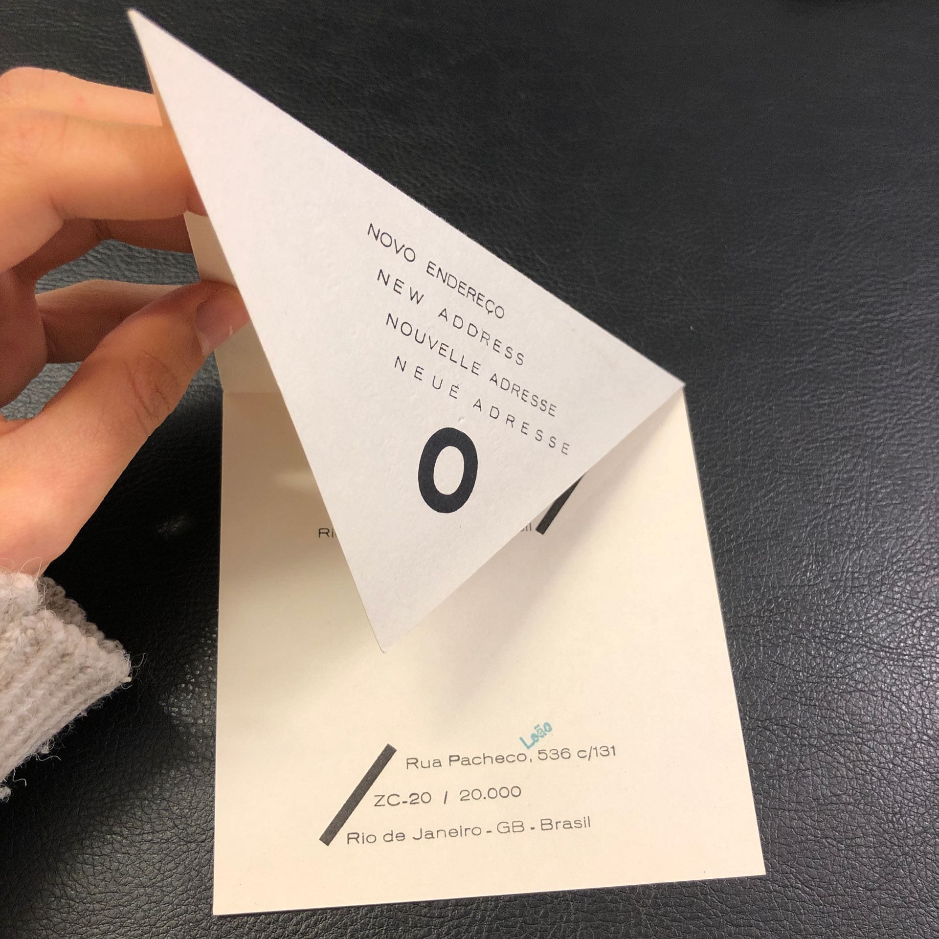
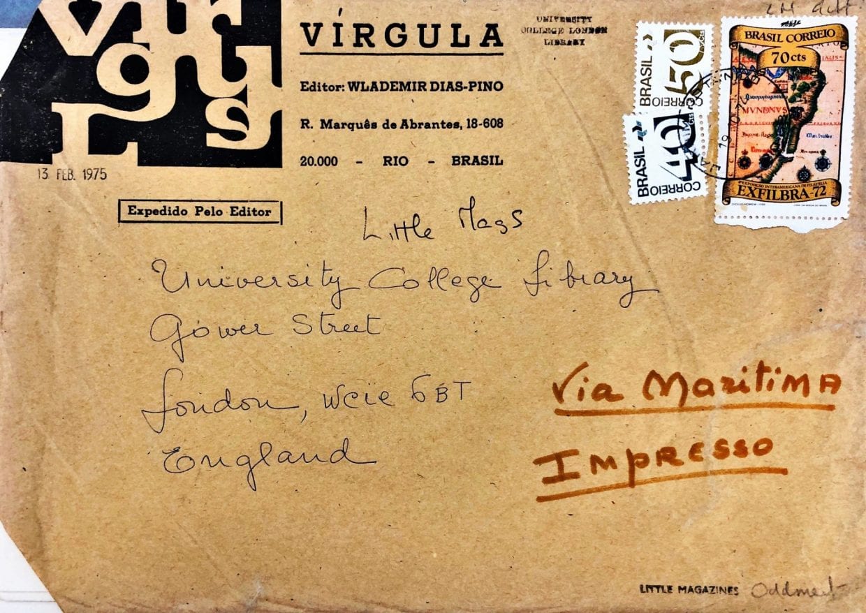
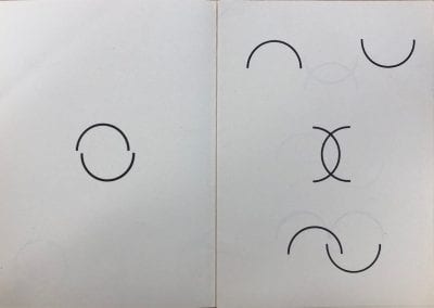
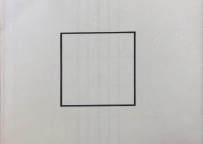
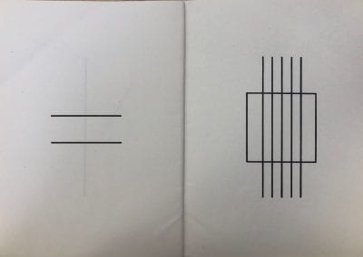
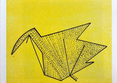
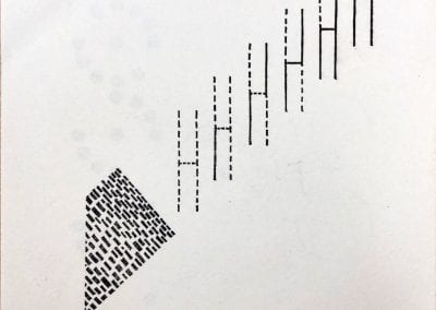
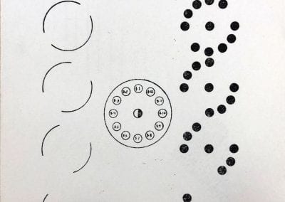
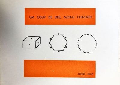
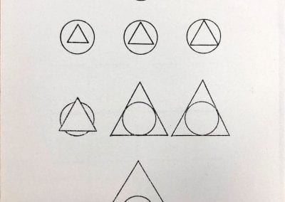
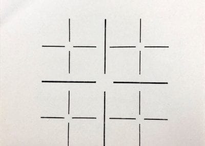
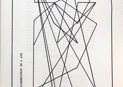
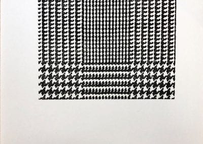
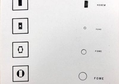
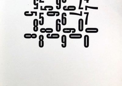
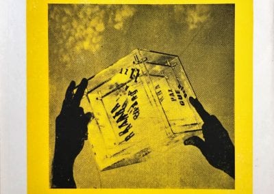
Virgula is a collection of artworks by artists from the Brazilian art movement Poema/Processo, put together by one of the co-founders Wlademir Dias-Pino. These artists expressed themselves in the context of a military dictatorship. Through art, they questioned ideas of authority. They also challenged traditional forms of communication. For example, they composed poems that look like drawings. These were issued as a magazine and sent through the post. Reading the magazine is an open process, with multiple possibilities of interpretation, that give the reader an active role. These poems are unconventional in that they are composed of images rather than words. Physical appearance and meaning are inseparable. The piece reminds us that language is not only about concepts but also about forms. Admiteddly, an image can be poetic, but do you think an image can be a poem? Where do you draw the limit between the written and the visual?
Notice the different shapes, their size, their thickness, how they stand on their own and how they interact with others as well as with the empty space. Do you feel a sense of gravity, of movement or of depth? Do they have an inner code, or do they refer to something else? How is it different or similar from reading traditional writing? Share your thoughts in the comments.
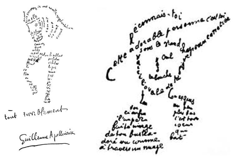
The poems in Virgula point out that when we read classic poetry we take the words for their meaning, not as images. We only see the signified, not the signifier. The French poet Guillaume Apollinaire blends the two. His calligrammes are poems in which the verses form an image. These texts-drawings were first published in 1918. The arrangement of the words and how they occupy the space of the page contributes just as much as the signification of the words themselves in the meaning of each poem.
Apollinaire, G. (2000). Calligrammes : poèmes de la paix et de la guerre. Paris: Gallimard.
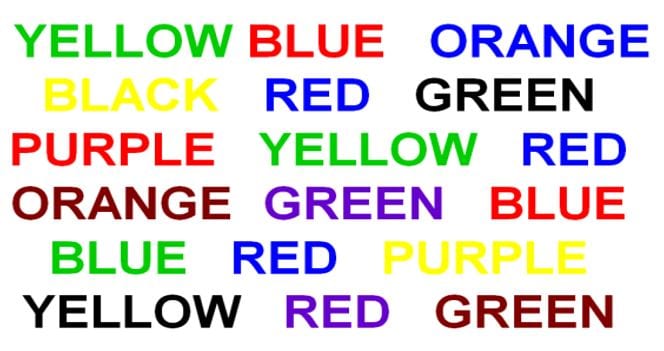
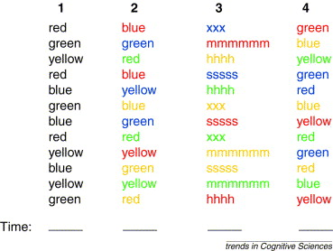
Try to enunciate the font colour of these words as quickly as you can. Hard, right ? This is called the Stroop effect. It shows that we cannot help thinking of the concepts the words represent, even when we attempt to see them as pure images. This psychological test is widespread in psychology, both in clinical practice and to investigate reaction times experimentally. We are much slower and prone to errors if the colour denoted and the colour of the ink mismatch, while if both are congruent (e.g. red is printed in red) naming is easy.
Time yourself with the following sheet and put your results in the comments !
